How do I get to statistics tab?
To get to the statistics tab, go to the listing page. You will see multiple ads based on your search criteria. Clicking on any ad title will open a detailed view. Click on the statistics tab.
Statistics Tab: Nuts & Bolts
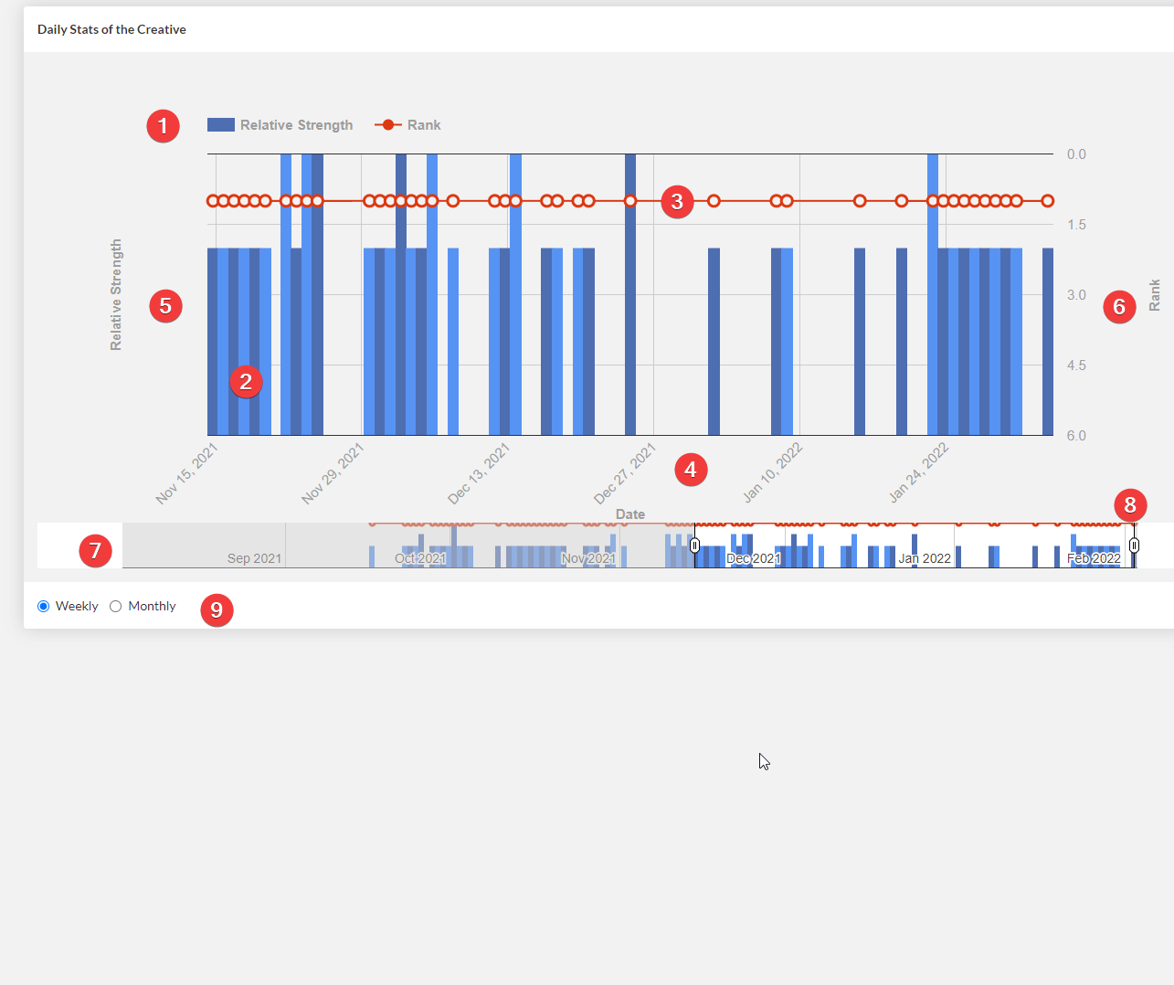
Statistics tab gives you a detailed graph of how frequently the particular ad has been seen over its lifetime. Please take a look at the labelled screenshot below to get an overview of different elements present in this tab:
Here is a brief explanation of each label in the figure above.
- Graph Legend - As evident from the graph legend, there are two types of graphs - red line graph & blue bar graph.
- Blue Bar Graph - The blue alternating bar graph shows the number of times an ad was seen on any given day/month.
- Red Line Graph - The red line graph shows the average rank of the ad on any given day/month.
- X-Axis of the Graph - It is time measured in either days or months depending on the selection.
- Y1-Axis of the Graph - It is measures relative strength in terms of the number of times the ad was seen as shown by the blue bar graph.
- Y2-Axis of the Graph - It measures the ad-rank of the graph displayed as a red line graph. It is always ranked from 1-5, 1 being the highest and most desirable rank. Higher rank means highest bidding ad.
- Range Viewer for the Graph - By default, you see the last 2 weeks of data when you open the the tab. Range viewer, however, allows you to see the graph for previous 1 year
- Controllers for the Range Viewer - These are 2 controllers that allow you to control the range of the zoomed graph. You can either zoom in or zoom out as shown in the video demonstration below:
- Monthly/Weekly Option - This radio button selection allows you to choose between monthly or weekly time scale on the X-axis as shown in the video demo below:
